
Picture this: a potential customer in Overland Park pulls out their phone to search for a local business like yours. They find your website, tap the link, and are greeted with tiny text, jumbled images, and buttons they can barely press with their fingertips. Frustrated, they hit the back button and choose your competitor instead. Sound familiar?
This is exactly why responsive design matters, and if you’re running a business in Kansas City, it could be the difference between winning or losing customers every single day. But don’t worry if the term sounds a little technical. By the end of this post, you’ll have a clear, simple understanding of what responsive design actually is and why it’s so important for your business.
We’ll walk you through the basics in plain English, no coding experience required. You’ll learn how responsive design works, why Google cares about it, and what steps you can take to make sure your Kansas City business website looks great on every device your customers use. Let’s dive in!
The Simple Version: What Responsive Design Actually Means
Think of responsive design like water. Water fills whatever container you pour it into, whether that’s a tall glass, a wide bowl, or a small cup. A responsive website works the same way. It automatically adjusts its layout, text size, and images to fit correctly on any screen, from a large desktop monitor to a tablet to the phone in your pocket. You do not need a separate mobile version of your site. One well-built website simply adapts to wherever your visitor is viewing it.
Without responsive design, the experience breaks down fast. A visitor landing on a non-responsive site from their smartphone will see a shrunken version of the desktop layout, forcing them to pinch and zoom just to read a paragraph, tap tiny links with their thumbs, or scroll sideways to find content that ran off the edge of the screen. That friction creates a poor first impression almost instantly, and web design shapes 94% of first impressions a visitor forms about your business.
Here is a scenario worth picturing. A potential customer in Overland Park is on their lunch break and searches for a local service provider on their phone. If your site is responsive, they land on a clean, readable page, spot your phone number right away, and call you. If your site is not responsive, they struggle to navigate it, give up within seconds, and move on to the next result. That is a real lead lost to a frustrating experience, not a lack of interest.
A responsive site solves all of that by delivering the same clean, tap-friendly, readable experience on every device, keeping visitors engaged longer and making it easier for them to take the next step with your business.
It is also worth knowing that responsiveness is no longer a premium feature reserved for big budgets. According to current web design statistics for 2026, approximately 90% of websites worldwide have already implemented responsive design. With over 250 web design companies listed in the Kansas City market on Clutch alone, responsive design is the established baseline, not a bonus upgrade. If your site is not responsive in 2026, it is not behind the cutting edge; it is simply behind.
Why Google Cares About Your Mobile Site (and Why You Should Too)
Here is something that surprises a lot of small business owners when they first hear it: Google does not judge your website based on how it looks on a desktop computer. It judges your site based on how it performs on a phone. This is called mobile-first indexing, and it has been Google’s active, permanent standard since 2024. Every single website is now evaluated this way, with no exceptions. If your mobile site is slow, hard to navigate, or missing key content that lives only on your desktop version, Google ranks you based on that weaker mobile experience.
For businesses in Kansas City, Overland Park, Olathe, and Shawnee Mission trying to show up in local search results, this matters more than most people realize. Think about how people actually find a local business. They are usually out running errands, sitting in a parking lot, or standing in line, and they pull out their phone to search. Over 60% of global web traffic now comes from mobile devices, and research shows that more than 76% of local searches made on a smartphone result in a store visit within 24 hours. That is a powerful number. Now picture someone searching “printing shop near Olathe” and landing on a site where they have to pinch, zoom, and scroll sideways just to read a phone number. Most people leave immediately, and Google notices.
Page load speed adds another layer. According to mobile SEO best practices for 2026, Google measures how quickly your content loads on a real mobile device over a 4G connection. A slow site signals poor user experience, which pushes your listing further down in local results. A non-responsive site almost always loads slower on mobile because images, layouts, and content are not optimized for smaller screens.
This is why local SEO works as a trifecta. Mobile responsiveness, fast page load speed, and a fully optimized Google Business Profile all support each other. Per current analysis of mobile-first indexing, a strong Google Business Profile loses effectiveness when the website it points to delivers a poor mobile experience. All three elements have to work together. A weak link in any one of them holds back the others, and in a competitive local market, that gap is the difference between showing up in Google’s local 3-pack or being invisible to the customers who are already looking for you.
First Impressions Happen in Seconds — Here’s What That Means for Your Business
Here is something worth sitting with for a moment: visitors form an opinion about your website in as little as 0.05 seconds. That is faster than a blink. And according to research, 94% of those first impressions are based entirely on design, not on your reviews, your years of experience, or the quality of your work. Before a potential customer reads a single word about your business, they have already decided whether to stay or go.
That reality hits differently when you think about it in local terms. Imagine a plumber in Olathe who runs a paid ad on Google. A homeowner sees it, clicks from their phone, and lands on a site with tiny text, misaligned buttons, and a contact form that will not load on mobile. That homeowner is gone in seconds, and every dollar spent on that ad goes with them. Users are five times more likely to abandon a site that is not mobile-optimized, and 73% of visitors leave non-responsive sites within seconds. The ad did its job. The website did not.
Or consider a food truck owner in Shawnee with a beautifully designed logo, glowing reviews, and a loyal following. But their website loads slowly on mobile, and there is no click-to-call button anywhere on the page. A hungry customer searching during their lunch break is not going to dig around for a phone number. They are going to close the tab and find someone easier to reach.
A conversion-focused, mobile-ready website removes those friction points entirely. It includes a visible click-to-call link, a simple lead form, clear calls to action, and a layout that naturally guides visitors toward the next step. Interestingly, research shows that 70% of small business websites have no call to action on the homepage at all, which means this is a fixable gap that gives attentive businesses a real edge.
Responsive design is not just about looking good on a phone. It is about making sure nothing stands between someone discovering your business and actually reaching out to you.
A Note for Kansas City’s Hispanic Business Community
Kansas City has a deep and proud history with the Hispanic business community. In fact, Kansas City was the founding city of the United States Hispanic Chamber of Commerce back in 1979, and that legacy of entrepreneurship is very much alive and growing today. The Latino population in the Midwest has grown rapidly over the past two decades, and Kansas City sits at the heart of that momentum. Many of the business owners driving that growth are serving customers who rely almost entirely on their smartphones to search, evaluate, and reach out to local companies. For this community, the phone is the primary window into the businesses around them, not a laptop at a desk.
This makes responsive design more than a technical checkbox. When a Spanish-speaking or bilingual customer pulls out their phone to search for a contractor, a print shop, or a local service in Overland Park or Olathe, what they find in those first few seconds tells them a lot. A site that loads slowly, displays broken text, or forces them to pinch and zoom to read contact information sends an unintended message. It says the business was not built with them in mind. A well-built, mobile-responsive site communicates the opposite: that you are ready, professional, and accessible to everyone in your community.
For bilingual businesses especially, responsive design ensures that Spanish-language content, service details, and phone numbers render cleanly on every screen. Poor formatting can make even a beautifully written bilingual page feel chaotic on a small device.
At GTN Studio, we build websites with mobile-first thinking from day one, because we understand this community personally. If your business serves Kansas City’s Hispanic community, your website should reflect the care and quality you bring to everything else you do.
Responsive Design Is Just One Piece of Your Brand
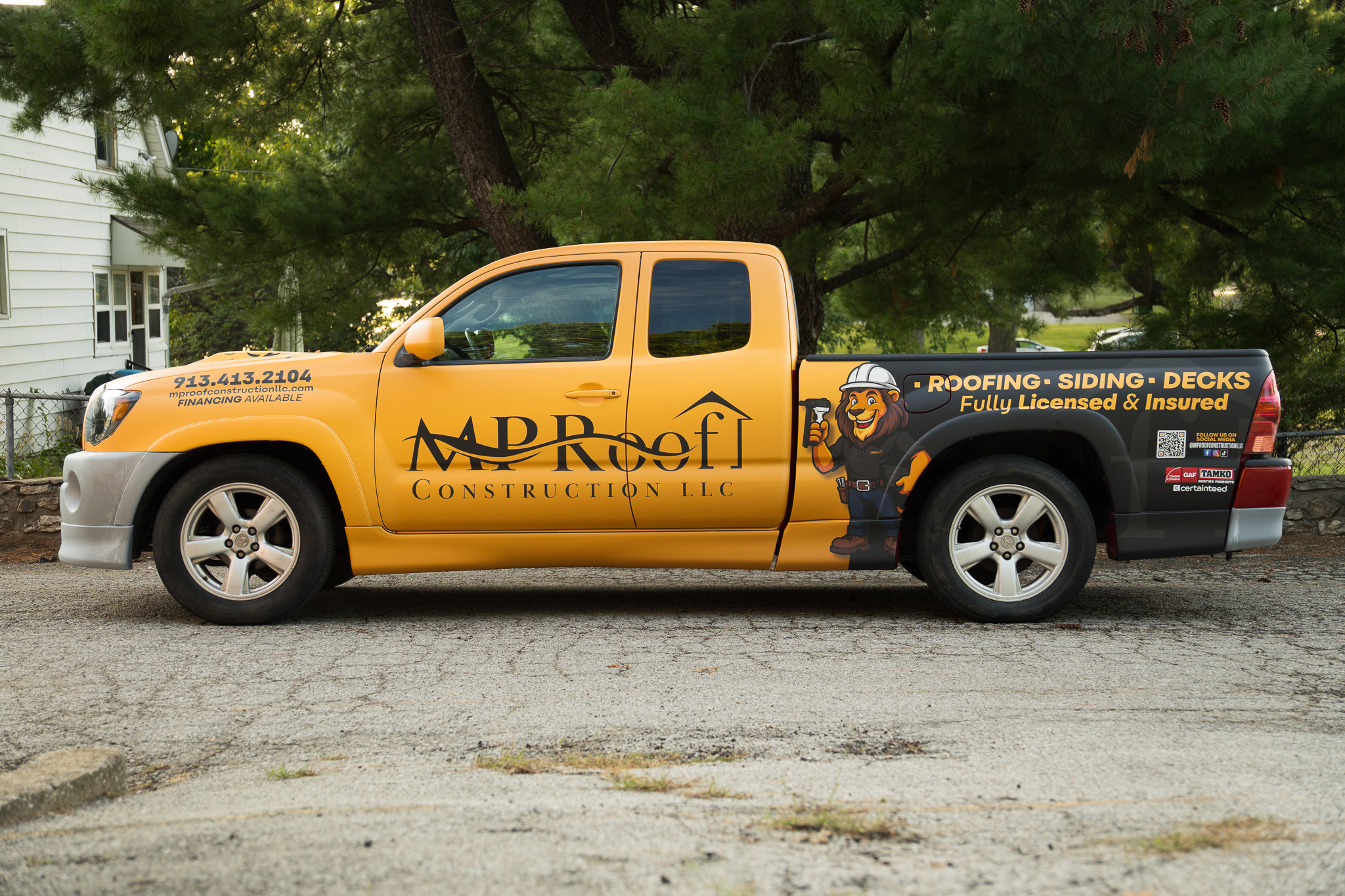
Your website is one of the most important brand touchpoints you have, but it is not the only one. Think about every place a customer might encounter your business: the truck parked outside a job site, the polo shirt your team wears, the business card handed across a table at a networking event, the banner at a local expo in Overland Park. Every single one of those moments is an introduction. And if they all look a little different from each other, customers notice, even if they can not quite explain why something feels off.
Visual branding consistency means keeping a uniform look and feel across all your marketing materials, both online and offline. That includes your logo, your colors, your fonts, and the overall tone your visuals communicate. A website that loads beautifully on a smartphone but uses a slightly different shade of blue than your fleet wrap, or a font that does not match your business cards, quietly signals to customers that something is disconnected. It does not build confidence; it creates doubt.
This is exactly where GTN Studio’s all-in-one approach makes a real difference for small and growing businesses across the Kansas City metro. When we design your website, we are not starting from scratch with a logo file someone emailed us. We already know your brand because we helped build it, from the logo we created to the vehicle wrap we installed. Your digital presence becomes a natural extension of your physical one, not a separate project that has to guess at your identity.
That concept-to-installation approach means nothing gets lost in translation between vendors. Every asset, whether it lives on a screen or on the side of a van rolling through Olathe, tells the same visual story. For a growing business, that kind of consistency is not just a design preference; it is how you get remembered.
What a Responsive Website Investment Looks Like for a Small Business
Let’s be honest about something most large agencies will not tell you upfront: professional web design in Kansas City can carry a steep price tag. Many established firms in the metro set project minimums at $5,000 or more, which is a real barrier for a small business owner who is already watching every dollar. According to the U.S. Chamber of Commerce Small Business Index, small business confidence dipped in late 2025, with nearly half of owners citing inflation as their biggest challenge. That financial reality makes the cost of entry for professional web design feel even steeper.
Here is the good news: a responsive website does not need to be enterprise-scale to do its job well. It needs to be clean, fast, mobile-friendly, and consistent with your brand. Those are achievable goals without a massive budget, and they are the exact goals a hands-on local studio focuses on for every project.
The smarter way to think about your website is as a business asset, not a one-time tech expense. A well-built, responsive site works for you around the clock, building credibility and capturing leads every time someone in Olathe, Overland Park, or anywhere across the Kansas City metro searches for what you offer.
The cost of doing nothing compounds quietly over time. Lost leads, slipping search rankings, and a mobile experience that undercuts the reputation you have spent years building in your community add up fast.
Working with a local Kansas City studio like GTN Studio means you get direct communication, real attention to your project, and a finished site that reflects your business, not a templated solution passed off to a remote team.
Ready to Build a Website That Works for Your Business?
If you have made it this far, you already know that responsive design is not a bonus feature or a nice-to-have upgrade. It is the foundation your entire online presence is built on. It shapes how Google ranks you in searches across Olathe, Overland Park, and Shawnee Mission. It shapes whether a potential customer stays on your site or bounces in seconds. And it shapes whether your phone rings or stays quiet.
Google is already making that judgment call right now, not at some future date. Every day your site is not mobile-ready is a day your competitors are showing up in local searches while you are not.
Here is where GTN Studio makes a real difference. We handle web development alongside graphic design, vehicle wraps, business stationery, and promotional products, all under one roof. That means your website, your work truck, and your business cards all speak the same visual language, because the same team built them.
With over 200 completed projects and a 5/5 customer rating, we stay involved from the first conversation to the final launch. Local SEO data confirms that 76% of people who search for something nearby visit a business within 24 hours. Your website needs to be ready when they are looking.
Reach out to GTN Studio today. No pressure, just a genuine conversation about what your website needs and how we can help your business grow.
Conclusion
Your Kansas City business deserves a website that works as hard as you do. To recap what we covered: responsive design ensures your site looks and functions beautifully on every device, Google rewards mobile-friendly websites with better search rankings, and a poor mobile experience sends potential customers straight to your competitors.
The good news is that fixing this does not have to be complicated or overwhelming. Small improvements can lead to real results, including more visitors, longer time on your site, and ultimately more paying customers walking through your door.
Ready to take the next step? Reach out to a local Kansas City web design professional today and ask about making your site fully responsive. Your future customers are already searching on their phones. Make sure what they find makes them choose you.